The placement of artworks in a gallery tells us stories: curators “write” with artworks, but do they know the effect of their “writing”? They do not—they cannot—track down the amount and the kind of narratives that germinate within visitors’ minds, after their encounter with a show—those stories are countless. With writers it’s not that different, nor with artists, but in the case of curators, they are usually rearranging pre-written “texts,” and there is that critical point between what the artwork says, and what the curator wants to make it say. The “story” of this last Whitney Biennial is now gone, its pages have been dissolved and it has become a memory of those curators’ writings. Far away, now in Brazil, I try to forget what I saw of the Biennial to remember one of its narratives, once again.
What I recall of the 4th floor of the Biennial, which was curated by Michelle Grabner, is an intimacy that reached me in different intensities: within the relationship between artists and their art object, between curator and artwork, and within the organization of the exhibition space, that pointed to a domestic realm. This trio—the home, intimacy, and crafts—transformed me into a detective, sniffing for clues, and as I went deeper into many of the works on that floor, this triad kept emerging, allied to a fourth and fifth element: interior and graphic designs.
When we got out of the elevator, Gaylen Gerber’s Backdrop (2014) welcomed us. A stretched canvas painted gray, it looked and acted like a wall, upon which Gerber hung other artists’ paintings (Trevor Shimizu’s, David Hammon’s and Sherrie Levine’s works were rotated during the course of the show). Past Backdrop, Sheila Hicks’ Pillar of Inquiry/Supple Column, (2013–14) came to our eyes, pouring from the ceiling like a motionless waterfall made of colorful fibers. Sterling Ruby’s works of the series Basin Theology (2013–14) are three oversized ceramics that replicated an aesthetics of primitive vessels: they look completely transported from Paleolithic times. Only their magnified size and vivid colors suggested otherwise. They are too perfect, too polished—establishing a conflict between rawness and technology. Alma Allen’s sculptures, all Untitled (2013), touched the limits of a pseudo-minimalism made of walnut and marble. In 187 Bottoms Up (2013), Joel Otterson used colorful goblets to create chandeliers that are irresistibly seductive: a decorative extravaganza. Together with Ricky Swallow’s bronzes that appeared rather like fragile paper sculptures, these pieces not only redefined form, but also challenged the limits of decoration. When I say decoration I do not mean that those pieces should be seen as ornamental, but that they play with the idea of decorative assemblage.
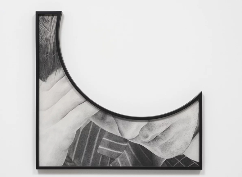
Among these works, one of my favorites was Karl Haendel’s wall of pencil drawings, which brought us close to a domain that is both dialoguing with and defying the borders of the domestic. The drawings are cut, and the frames follow the cuts, becoming not simple adornment, but structuring the works. They seemed to be imprisoning the figures depicted, but also giving them new context. That is usually what frames do, but in Haendel’s case they were also treated as if they were part of the drawings, coming out of the wall. The pencil work, so delicate and realistic, is the outcome of a meticulous process of choosing subjects, photographing them and projecting slides on a wall, which are finally drawn, maintaining their appearance of photographs. The artist’s arrangement in the gallery connected drawings and frames through yellow painted lines on a gray wall. The final effect reminded me of interior design advertisements depicting luxury apartments. But these were also drawings fighting against and working within the cuts that limit them; challenging their own exquisite nature. In Theme Time - Tears (Head on hand) (2014), the round cut takes away something of the drawing—almost the entire human face—to add so much to it, it as if the artist is saying: Put there what you will.
These works speculated on how it would be to become interior design, and thus also, how to cross the bridge between art and design, handmade and technology, the studio and the home. They desired an intimacy with the domestic realm, but, within the curatorial arrangement of the show, they ended up infecting the sacredness of the white cube: they seductively polluted it. In a sense, while minimalism was born from this relationship with the gallery space, within the current condition of contemporary art, these works have, hopefully, exhausted the white cube—they know it too well. So now they could allude to particular spaces that are articulated through the domestic—not anymore only the institutional, the commercial or the public.
This intimacy exploded when female painters “contaminated” their pieces with a slight similar impulse: design and handmade work. Laura Owens’ Untitled (2014) depicted a boy and a dog holding on to a rope in an immense canvas: an illustration that seemed to be taken from a second-hand children’s book, or an outdated advertisement one would find in a kids’ magazine. The painting has two other components: smaller canvases that were placed inside the larger piece. If I were a mother I would paint something like that, place it on a wall, observe it every day, and then the painting would transform me into a children’s storyteller forever. Amy Sillman made us want to feed from color with her painting Mother (2013–14) and in collaboration with Pam Lins, created Fells (2013–14), in which they transformed the back of a painting into a shelf with ceramics. In 41/14 (2014) and Untitled (2014) Jacqueline Humphries overcame the canvases as if they were black texture on paper, while Dona Nelson’s perforated both sides of the painting Okie Dokie (2008), as if stating, “I want it all.” And “NO!,” protested Molly Zuckerman-Hartung in Notley (2013), painting the giant word on a ragged canvas.
Those “words,” those works, are now disconnected, far from each other and from the museum in which I saw them. The narrative that together they built is gone, but the memories of that story still ring in my mind: those works made me feel at home, a home which is the artist’s and my own; works that are quasi-expertly crafted, but that are also odd: too familiar, and often too aesthetically perfect. When I look back on them, they escape all those previous definitions; they plunge into the ornamental, the cliché, which made me fall in love with them then; and today, as I remember them all over again.
-----
From the Zephyr print edition published fall 2014.


